The Skipton Blueprint. Forty-four pages, one promise.
The Skipton Blueprint covers strategic foundation, verbal identity, visual system, applications and governance. Every page is written in the Skipton voice — rooted, assured, considered — and built on the blueprint aesthetic.
A three-page preface sets the strategic context before Section 1.
Why this Blueprint exists. The argument for fairness, distilled — and the one-page DNA that everything else flows from.
01 · ManifestoPreface · The argument
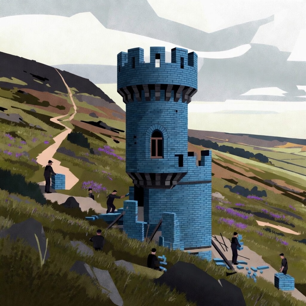
Brand › Preface › Manifesto
We were Founded on Fairness.
One hundred and seventy-two years on, that's still the only thing that matters.
In 1853, a group of Yorkshire workers pooled their wages to help each other buy homes. That's where Skipton started. Not as a bank. As a mutual.
The country has changed. The financial system has changed. The houses we now sell mortgages on were probably fields back then. What hasn't changed is the founding test: do members get a fair deal? If yes, we keep going. If not, we stop and fix it.
Fairness is what we mean by Founded on Fairness. It isn't a strapline. It's the question we ask before every product, every rate change, every line of marketing copy.
Fair to members. Fair to renters trying to buy. Fair to the people who'll inherit. Fair to colleagues. Fair, even when it costs us a quarter to be that way.
This is what the Blueprint is here to protect.
Brand › Preface › Manifesto
1 / —
02 · Why fairnessPreface · The argument
Brand › Preface › Strategic context
Why fairness, and why now.
Fairness isn't an old-fashioned virtue we're dusting off. It's a current commercial truth. Four research findings that turn the founding principle into a present-day argument.
Cultural
Britons believe in fairness. Most think the country has lost it.
75% think wealth and income inequalities are a problem. 85% are concerned about inequality overall. 58% believe society is becoming less fair.
Icon needed
Category
In financial services, fairness is the dealbreaker.
Half of UK adults have experienced an FS provider not acting fairly towards them. Only 36% think most financial firms are honest. 45% say fairness is an important factor when choosing.
Consumer
Humans are wired for fairness.
Behavioural and neuroscience research traces signatures of fairness back into childhood. People across age groups define it the same way: doing the right thing when no one is looking.
Icon needed
Brand
Skipton has been arguing this case for 172 years.
A mutual since 1853, 1.2 million members today. Built on fairness as a structural fact, not a marketing position. No shareholders to please at members' expense.
Brand › Preface › Strategic context
2 / —
03 · Brand DNAPreface · The argument
Brand › Preface › Reference
The brand at a glance.
One page. The rest of the Blueprint is the longer version of what's on this page.
Purpose
To help more people have a home, save for the future, and support their long-term financial wellbeing.
Icon needed
Belief
Everyone deserves a financial provider that does the right thing when no one's looking.
Behaviours
We answer to members. We take the long view. We say it plainly. We show up when it's hard. We earn trust slowly. (Section 1 · Values.)
How we sound
Rooted. Assured. Considered. Plain English. Short sentences carry weight. (Section 2 · How we sound.)
How we look
Marine ground. White rule. Turret display. Roboto body. Founded on Fairness lockup. (Section 3 · How we look.)
Strapline
Founded on Fairness. Six syllables. Says everything we mean.
Founded on Fairness
Established 1853 · The brand promise at the centre of all six.
Brand › Preface › Reference
3 / —
Section 1
Strategic foundation
Why Skipton exists, who it serves, and what it stands for. The arguments behind every decision that follows.
04 · Brand storySection 1 · The brand
Brand › Foundation › Story
A 172-year promise.
172 years. 1.2 million members. No shareholders, never had any.
A brand isn't a logo. It isn't a colour palette. It's the way we keep showing up — for the people who own this place, the towns we lend in, and the colleagues who do the work. This book is the kit for showing up well. The next page is the why.
Three things that have not changed
01
Member-owned. No shareholders. No external owners. Just 1.2 million members.
02
Profits shared. Better rates, better service, causes our members vote on.
03
Built to last. We are not for sale. We are not in a hurry. We answer to the next generation as much as this one.
Brand › Foundation › Story
4 / —
05 · Founded on FairnessSection 1 · The brand
Brand › Foundation › Founded on Fairness
Founded on Fairness.
Fairness isn't a campaign line. It's the reason we exist.
In 1853, a group of people in Skipton pooled their savings so that families in the town could own their own homes — not because a bank would lend to them, but because their neighbours would. That idea became a building society. 172 years on, it's still the idea we're built on.
Founded on Fairness means three things, and they haven't changed: fairness to the members who own us, fairness to the society we operate in, and fairness to the colleagues who turn up every day to do the work.
It's why we share profits instead of paying shareholders. It's why we offer free financial advice to people who'd never normally get it. It's why we build mortgages for renters who've been told no everywhere else.
The bookend
Fairness isn't what we say. It's what we were set up to do.
And it's what we'll keep doing, for as long as there are members to do it for.
The voice flexes by audience
Members › ownership and rewards.
Colleagues › internal integrity.
First-time buyers › the system, and our specific fix.
Brand › Foundation › Founded on Fairness
5 / —
06 · Mission & visionSection 1 · The brand
Brand › Foundation › Purpose
Why we get up in the morning.
Purpose
To build a fairer way to look after money.
Why we exist. The fixed point we navigate from. Doesn't change with strategy cycles or leadership.
Vision
A million members better off because we exist.
What success looks like. Measured in member outcomes, not shareholder returns.
Mission
Help members save with confidence and own their homes with less stress.
What we do day to day. The work. The two things every product, every page, every conversation should help with.
If it doesn't help someone save with more confidence, or own a home with less stress, it's the wrong work. Doesn't matter how clever it is.
Brand › Foundation › Purpose
6 / —
07 · Brand pillarsSection 1 · The brand
3 Pillars
Brand › Foundation › Pillars
What Founded on Fairnessmeans.
Three fairnesses. They've been the same since 1853 and they govern every decision we make as a brand.
01
Fair to our members.
Members own this place. Profits flow back to them — better rates, better service, causes they vote on. We don't run for the next quarter. We run for the lifetime of a savings plan.
02
Fair to society.
Free financial advice for people who'd never normally get it. Mortgages built for renters who've been told no everywhere else. Long-term thinking on housing, on inheritance, on the unglamorous problems that compound.
03
Fair to colleagues.
Fairness has to be real inside the building before it reaches a member. Fair pay. Fair hearing. Fair chance. You can't fake one without the other.
Brand › Foundation › Pillars
7 / —
08 · ValuesSection 1 · The brand
Brand › Foundation › Values
Five behaviours.
The pillars are what we believe. These are how we behave. They're the test for any creative decision: would a member recognise us in this?
01 — We answer to members
Not to shareholders. Not to a quarterly cycle. When we have to choose between member benefit and brand polish, member benefit wins.
02 — We take the long view
We're here for the next few decades, not the next transaction. We don't manufacture urgency. We don't push a product that isn't right.
03 — We say it plainly
Plain English. Concrete nouns. House, not property. Money, not funds. If a member can't follow it, we haven't finished writing.
Icon needed
04 — We show up when it's hard
Bereavement. Complaints. Missed payments. The moments most brands hide from. The moments that prove the promise.
Icon needed
05 — We earn trust, slowly
Trust is a 172-year-old asset. It's built one fair decision at a time. It's lost in one shortcut. The brand exists to protect that ledger.
Brand › Foundation › Values
8 / —
09 · AudiencesSection 1 · The brand
Brand › Foundation › Audiences
Who we're talking to.
Four overlapping audiences. The voice doesn't change. What changes is what we lead with.
Long-tenure savers
Median age 58. ISA holders, regular savers. Have been with us a decade or more.
What they value: stability, clear rate communications, no surprises.
Internal. Branch staff, contact centre, head office, prospective hires.
What they value: being treated like adults, fair process, honest communication.
Foreground: fairness inside the building, not just on the marketing.
Voice consistent. Emphasis flexible. A first-time buyer page and a pre-retiree page should sound recognisably the same brand. What changes is what we lead with.
Brand › Foundation › Audiences
9 / —
Section 2
Verbal identity
How we sound — traits, tools, and the editorial discipline that keeps us honest under pressure.
10 · Voice traitsSection 2 · How we sound
Voice
Brand › Voice › Three traits
Rooted. Assured. Considered.
Fairness runs through all three. If you can't hear all three in a piece of copy, it isn't Skipton yet.
Rooted
Sounds like we come from somewhere. Plain, unfussy, no marketing puffery. We don't perform Yorkshire — we just sound like ourselves.
Is: grounded, direct, unfussy, honest about what matters.
Isn't: parochial, folksy, cartoonish, stuck in the past.
Assured
172 years of showing up. We've earned our confidence, so we don't need to shout.
Is: confident without bragging, calm under pressure, clear about what we know, honest about what we don't.
"We've seen rates rise. We've seen rates fall. We've seen members through both."
Triads
Three-part lists land harder than two or four. Easier to remember.
"Your savings. Your plan. Your pace."
Short, then long
The core rhythm. Short sentences carry weight. A longer sentence lets the reader breathe.
"Not the quickest rate. Not the flashiest app. Just the fairest deal we can offer."
Mirrored structures
Repetition's cousin. Creates a sense the brand is thinking alongside the reader.
"When things go well, we're here. When things don't, we're still here."
Sparing alliteration
One alliterative phrase per passage, max. If the alliterative word isn't also the best word, pick the best word.
"Steady hands in unsteady markets."
Concrete over abstract
Shorter, clearer, more Yorkshire.
House, not property · money, not funds · kids, not dependants
Full stops over commas
Break long sentences up. Trust the reader.
Sentence fragments
Used deliberately, never habitually. They add rhythm. Used well.
Brand › Voice › Toolkit
11 / —
12 · Voice in practiceSection 2 · How we sound
Brand › Voice › In practice
Do this. Not that.
The same message, written two ways. Read both aloud. Hear the difference.
DO — ROOTED
Saving for a house takes time. Years, usually. We've helped three generations of members do it, and we'll help you too — whatever your timeline, whatever your deposit, whatever the market's doing that week.
DON'T
Purchasing a property is a significant financial undertaking that typically requires sustained saving over an extended period. Our team of experts is ideally placed to support you throughout this important journey.
DO — ASSURED
Inheritance tax won't go away by ignoring it. But it won't ruin your family, either — not if you plan early, plan properly, and plan with someone who's done this before. That's us.
DON'T
Inheritance tax planning can be a complex area, and it's important to ensure you have the right support. Our advisers have extensive experience and would be delighted to help you navigate the various options available.
Brand › Voice › In practice
12 / —
13 · High-stakes copySection 2 · How we sound
Brand › Voice › High-stakes copy
When stakes are high, strip the style back.
Bereavement. Complaints. Missed payments. Financial difficulty. The moments most brands hide from. No alliteration, no triads, no clever flourishes. Clarity beats craft. Just help.
Bereavement letter — opening
We're sorry for your loss.
Dealing with a loved one's finances is one of the hardest things you'll do, and we want to make our part of it as simple as we can.
One person will handle everything with you. Their number is on the next page. Call when you're ready.
Rate change — member letter
Your savings rate is changing on 1 June.
Your current rate: 4.25%. Your new rate from 1 June: 4.10%.
We know rate changes matter. We know they affect real plans — a deposit, a holiday, a buffer for when things go wrong. So here's what's happening, why, and what your options are.
One test for high-stakes copy: would you say it out loud, in person, to the member receiving it? If not, rewrite.
Brand › Voice › High-stakes
13 / —
14 · Plain EnglishSection 2 · How we sound
Brand › Voice › Plain English
Reading age 12. That's the bar.
If a member can't follow it, we haven't finished writing. The Plain English commitment isn't a stylistic preference — it's an accessibility requirement, and it's one of the ways we keep the Founded on Fairness promise in writing.
The five rules
01Short sentences. Average 15 to 20 words. Anything over 30 needs a reason.
02Active voice. "We changed your rate," not "your rate has been changed."
03Concrete nouns. House, not property. Money, not funds. Kids, not dependants.
04One idea per sentence. Full stops are free. Use them.
05Translate jargon, don't smuggle it. If you must use a term, define it the first time.
The check
Run every member-facing piece through the Hemingway editor or a similar tool. Aim for grade 6 to 8 reading age. Higher than that triggers a rewrite.
Where this matters most
Rate change letters. Mortgage application forms. Bereavement correspondence. Complaints. Anywhere a misunderstanding has consequences. The harder the message, the simpler the language.
Brand › Voice › Plain English
14 / —
15 · GlossarySection 2 · How we sound
Brand › Voice › Glossary
Plain-English translations.
The financial terms members trip over, with the words we use instead. When the term is unavoidable, define it the first time you use it.
Don't lead with
First-mention plain version
Notes
APR / AER
The yearly rate, including fees
Spell it out the first time. Acronym is fine after that.
Drawdown
Taking money out of your pension a bit at a time
"Pension drawdown" if context demands it.
LTV
How much you're borrowing compared to what the home is worth
Avoid the acronym in customer copy entirely.
Equity
The part of your home you own outright
For first-time buyers especially.
ISA allowance
The amount you can save tax-free each year
Then quote the figure.
Fixed term
A set period — usually 1, 2, or 5 years
State the period in the same sentence.
Variable rate
A rate that can go up or down
Pair with the trigger ("if the Bank of England changes…").
Mortgage broker / intermediary
An adviser who arranges mortgages for you
Use "adviser" first, "broker" second.
Beneficiary
The person who'll receive your money
For wills, life insurance, account nomination.
Probate
The legal process of sorting out someone's affairs after they die
In bereavement contexts, define every time.
Funds
Money
"Money" in 9 cases out of 10. "Funds" only in legal/regulatory.
Property
Home, house, flat
"Property" only when it genuinely means a portfolio or asset class.
Brand › Voice › Glossary
15 / —
16 · NamingSection 2 · How we sound
Brand › Voice › Naming
Naming products and campaigns.
A good Skipton name does the job in one read. Plain. Specific. Slightly understated. If a name needs an explainer, it isn't finished.
Product names
Describe what it does, in member language. Two or three words.
Yes Track Record Mortgage
Yes Delayed Start Mortgage
Yes Members' Cash ISA
No Skipton Velocity Plus
No The Aspire Plan
Capitalisation
Title Case for product names on first mention. Sentence case in running copy unless the product name is unambiguous.
Campaign names
Internal codes can be playful (and short). External campaign lines should sound like Skipton sentences, not slogans.
"Built on fairness." · "Steady hands." · "Your savings, protected since 1853."
Skipton, never SBS · Building Society, never "the Society" in customer copy · members, not customers.
Brand › Voice › Naming
16 / —
Section 3
Visual system extensions
How the marque, colour, type, and image systems behave across the bits the original Blueprint doesn't cover.
17 · Brand codesSection 3 · How we look
Brand › Visual › Brand codes
Four codes, on every page.
The visual system reduces to four mandatory devices. Every Skipton design carries them. If a piece of work is missing one, it isn't on-brand yet.
Colour palette
Three blues do most of the work. Stone and Midnight handle warmth and contrast.
See p26.
Founded on Fairness
Founded on Fairness
The endline of the brand. Sits in the top-right corner of every page.
See p22.
Rolling hill
The white quarter-circle in the top-left of every page card.
See p24.
Our castle
The standalone Skipton mark — used where the wordmark won't fit, or to anchor the bottom-right corner.
See p18–p21.
Brand › Visual › Brand codes
17 / —
18 · Logo clearspaceSection 3 · How we look
Brand › Identity › Logo clear space
Give the mark room to breathe.
Clear space is measured in the cap-height of the wordmark — we call it x. Nothing else — type, image, edge of page, another logo — should enter that zone.
Minimum clear space
Space around the wordmark, measured by the cap-height of the “S”. Nothing enters that zone — type, image, edge of page, or another logo.
Rule: the “S” cap-height is the unit. Honour it on every side — top, right, bottom, left.
Minimum sizes
Below these sizes, legibility fails. The mark is no longer doing its job.
Print — 22 mm wide minimum (full horizontal lockup).
Digital — 90 px wide minimum.
Favicon — use the castle on its own, not the lockup.
Embroidery — 35 mm wide minimum to preserve detail.
Never modify
No stretching, no recolouring outside the approved palette, no drop shadows, no outlines, no rotation, no rebuilding from scratch in another typeface. Use the supplied SVGs.
Brand › Identity › Logo clear space
18 / —
19 · Logo on backgroundsSection 3 · How we look
Brand › Identity › Logo on backgrounds
Which lockup, where.
Three approved colourways. The rule is contrast and legibility — not personal preference.
White on Marine
Default lockup. Use across covers, headers, hero panels, dark photography.
Marine on White
Light layouts, paper applications, document letterheads, member statements.
Cyan on Deep Marine
High-contrast applications. Branch signage at night, motion lower-thirds, dark UI.
DO
Place white logo on flat marine, deep photography (60%+ darkness), or any approved colour at full opacity. Always check contrast against AA.
DON'T
Place the logo on busy imagery without a tint, on cyan-only backgrounds, or any colour where contrast falls below 4.5:1. If you have to squint, choose another lockup.
Brand › Identity › Logo backgrounds
19 / —
20 · Logo do's & don'tsSection 3 · How we look
Brand › Identity › Logo do's & don'ts
The eight don'ts.
The mark has been refined over 172 years. Don't redraw it on a Tuesday afternoon. If you find yourself wanting to, ask the brand team for the variant you need — chances are it already exists.
Don't stretch.
Never alter the proportions horizontally or vertically.
Don't rotate.
The lockup is horizontal. Always.
Don't recolour.
Use only approved colourways.
Don't add effects.
No drop shadows, glows, or outlines.
Don't place on busy backgrounds.
Contrast is the rule, not preference.
Other text crammed
Don't crowd.
Honour the clear-space rule on every side.
Don't fade.
100% opacity always. The mark isn't a watermark.
Skipton
Don't retype.
Never recreate the wordmark in another typeface.
DO — use the supplied SVGs unchanged, on an approved colourway, with full clear space, on a background that meets contrast AA. If a layout pushes you toward any of the eight don'ts, change the layout, not the mark.
Brand › Identity › Do's & don'ts
20 / —
21 · Co-brandingSection 3 · How we look
Brand › Identity › Co-branding
Sharing space with partners.
When Skipton sits next to a partner or a sponsor, the relationship has to be obvious at a glance. Three approved configurations. No others.
Endorsed
IN PARTNERSHIP WITH
Partner Mark
Skipton lead, partner second. Use when we are the host, sponsor, or driving party.
Equal lockup
Partner Mark
Equal stature. Vertical rule between. Use for joint ventures, shared products, peer charities.
Hosted
PROUD SUPPORTERS OF
Partner Mark
Partner lead, Skipton in support. For sponsorships, charity partners, community events we underwrite.
One rule across all three: the mark heights match within 10%. The clear-space rule (x on every side) applies to both logos in the lockup.
Brand › Identity › Co-branding
21 / —
22 · Founded on Fairness lockupSection 3 · How we look
Brand › Visual › FoF lockup
The endline, locked in.
Founded on Fairness is the brand's promise in six syllables. The lockup is how it appears on every Skipton page — the marine block, the white type, the inward curve. Treat it as architecture, not graphic.
Where it sits
Top-right corner of every page card. Anchored to the frame, with the inward curve on the bottom-left so it reads as part of the corner architecture, not a graphic dropped on top.
Composition
Skipton Blue #069DE5 fill.
White FOUNDED ON / FAIRNESS wordmark, two lines, top-right of the block.
Bottom-left corner curves inward; top and right edges run flush to the frame.
Use the supplied SVG. Do not rebuild from scratch.
Brand › Visual › FoF lockup
22 / —
23 · FoF spacingSection 3 · How we look
Brand › Visual › FoF spacing
How much room it needs.
The FoF lockup never floats. It always meets the frame. These are the rules for how it sits, and how much clearspace it gets when used outside its default position.
Mortgages
Knock knock
FLUSH TO TOP
FLUSH RIGHT
Default position
Top-right of every artefact — page, poster, social tile, video end-frame. The lockup is part of the page frame: top edge and right edge run flush to the marine border.
Sizing
Width of the lockup is roughly 1/3 of the artefact width on portrait formats, and 1/6 on landscape. The wordmark's cap-height should never read smaller than the body copy on the same surface.
When detached
If the lockup is used standalone (no surrounding marine border), give it clearspace equal to the height of the wordmark on every side. Nothing enters that zone.
Brand › Visual › FoF spacing
23 / —
24 · Rolling hillSection 3 · How we look
Brand › Visual › Rolling hill
The corner that proves it's us.
The white quarter-circle in the top-left of every page card. It's a signature. Quiet, but constant. Its size is set against the page frame, never the content inside.
PLACEHOLDER
Diagrams to follow.
Rolling hill sizing rules and ratios.
Brand › Visual › Rolling hill
24 / —
25 · TypographySection 3 · How we look
Brand › Identity › Typography
Two faces. One job each.
Turret 1853 sets the moments that matter — headlines, statements, signature numbers. Roboto carries everything else — the explanation, the small print, the hours on the door. Mix them deliberately, never accidentally.
Display
Turret 1853 Bold
.OTF · LICENSED
Aa
Founded on Fairness.
Bold weight only. Set tight, never tracked open. Reserved for headlines, page titles, and signature numbers.
Body
Roboto + Roboto Condensed
.TTF · OPEN
Aa
A brand isn't a logo. It's the way we keep showing up.
Roboto for body, Roboto Condensed Bold for eyebrows and labels. Weights: 300 / 400 / 500 / 700.
The type scale
Display · Turret 92 / 0.95
A 172-year promise.
Section · Turret 44 / 1.05
Where the brand has a front door.
Eyebrow · Roboto Cond 16 / +0.18
Brand › Foundation › Story
Body · Roboto 17 / 1.55
For the people who own this place, the towns we lend in, the colleagues who do the work.
Caption · Roboto 12 / 1.45
Source: Skipton member report 2025. Figures audited March 2026.
Brand › Identity › Typography
25 / —
26 · Digital colourwaysSection 3 · How we look
Brand › Visual › Colour
The blues that do most of the work.
Three blues across the system, plus warmth, contrast, and a pale tone for breathing room.
Primary
The brand blues. Used across nearly every Skipton surface.
Marine Depths
#0062A8
Skipton Blue
#069DE5
Arctic Blast
#8AE8FF
Secondary
Warmth, contrast, and a quiet background tone.
Stone
#FAF6F3
Midnight
#1E1F29
Pale Rider
#E5EFF6
Brand › Visual › Colour
26 / —
27 · Digital gradientsSection 3 · How we look
Brand › Visual › Gradients
Gradients earn their place.
Three gradient sets — Primary Blue, mid blue, Arctic Frost. Used for backgrounds and illustration fills. Never for type. Stops and opacities defined; don't improvise.
Primary Blue
Stop 1 — #1971B1
Stop 2 — #0062A8
Stop 3 — #004E86
Overlay — 10% white / 20% black
Mid Blue
Stop 1 — #0062A8
Stop 2 — #069DE5
Stop 3 — #8AE8FF
Overlay — 10% black
Arctic Frost
Stop 1 — #D0F6FF
Stop 2 — #8AE8FF
Stop 3 — #8AE8FF
Overlay — 60% white
Brand › Visual › Gradients
27 / —
28 · Print colourwaysSection 3 · How we look
Brand › Visual › Print
When it's ink, not pixels.
CMYK breakdowns for the print palette. Marine Depths and Skipton Blue carry most of the weight. Use Pantone equivalents only if the press calls for it.
Marine Depths
100 50 0 10
Skipton Blue
100 0 0 0
Midnight
79 73 56 69
Arctic Blast
41 2 0 0
Grey
5 4 2 0
Brand › Visual › Print
28 / —
29 · IconographySection 3 · How we look
Brand › Visual › Iconography
A working library.
97 icons. White-filled SVGs, 100×100. Concrete things drawn plainly — one library across products, journeys, branch and social. Pages 29–33 list every icon by name.
Ben to populate this page with the illustration kit.
Brand › Visual › Illustration
34 / —
35 · PhotographySection 3 · How we look
Brand › Visual › Photography
Photography.
Casting, lighting, and composition principles — to be added.
PLACEHOLDER
Content to follow.
Ben to populate this page with the photography direction.
Brand › Visual › Photography
35 / —
36 · Image treatmentSection 3 · How we look
Brand › Visual › Image treatment
Make it Skipton-blue.
Hero imagery gets a subtle blue treatment so it sits inside the visual system. Not a heavy duotone. Not a gimmick. Just enough to remove jarring colour and read as ours.
Untreated
Treated
Untreated
Treated
Untreated
Treated
Rules
Multiply or soft-light blend mode at 25–40% opacity. Marine #0062A8 base. Never a hard duotone — natural skin tones must remain readable. Test against accessibility (eyes, hands, text in image must stay legible).
Brand › Visual › Image treatment
36 / —
37 · Data visualisationSection 3 · How we look
Brand › Visual › Data visualisation
Numbers should tell a clear story.
Skipton charts are honest before they're pretty. Member outcomes, savings projections, rate histories — the data is the point. Decoration is what hides bad data.
Chart example
EASY-ACCESS AER · 2021–2025 · ILLUSTRATIVE
+0.8%
VS. MARKET, 2025
Skipton AER
UK market average
The five rules
01Label the axes. Always. No exceptions.
02Start the y-axis at zero. If you can't, say why on the chart.
03One headline number, called out in Turret.
04No 3D, no bevelled bars, no gradient fills inside data shapes.
05If a member couldn't read it, redraw it.
The fairness test for charts: would the chart still be honest if you removed the brand colours? If it relies on visual flourish to make the case, the case isn't strong enough.
Brand › Visual › Data visualisation
37 / —
38 · MotionSection 3 · How we look
Icon needed
Brand › Visual › Motion
Motion.
Easing, timing, transitions and motion principles — to be added.
PLACEHOLDER
Content to follow.
Motion principles, easing curves and durations.
Brand › Visual › Motion
38 / —
Section 4
Applications
Stationery, signage, social, templates — where the brand meets the world.
39 · StationerySection 4 · Where it shows up
Brand › Application › Stationery
Stationery.
Letters, business cards, email signatures — to be added.
PLACEHOLDER
Content to follow.
Letterhead, business cards, email signature.
Brand › Application › Stationery
39 / —
40 · Social channelsSection 4 · Where it shows up
Brand › Application › Social playbook
Social, the Skipton way.
We are quiet on social on purpose. Frequent enough to be present. Considered enough to be worth following. We don't chase trends and we don't post about Pancake Day.
Posting cadence
LinkedIn: 3—4 posts a week. Member outcomes, expert pieces, colleague stories.
Instagram: 2 posts a week. Heritage, branches, communities we work in.
Facebook: 1—2 a week. Member-service forward.
X: service replies and rate-change announcements. Not a marketing channel.
What we post about
Members getting into homes who'd been told no elsewhere.
How a financial concept actually works. Real teaching.
Causes our members vote on. Behind the scenes.
The view out of a Skipton branch window. Heritage. Place.
What we don't
Hot takes. Topical days. Influencer collabs. Dance trends. Anything that sounds like a fintech.
Tone in 280 characters
"Bought a flat last week. Skipton's mortgage adviser sat with me for an hour and explained why the cheapest rate wasn't the best one for me. Saved me £3,400 over five years. — Aisha, member since 2024"
Plain. First-person where possible. A real number. No emoji-stacking, no hashtags except the campaign tag, no trailing platitudes.
Brand › Application › Social
40 / —
Section 5
Governance
Who looks after this. Where the assets live. The legal lines we don't cross.
41 · The teamSection 5 · Looking after it
Brand › Governance › The team
Who keeps it running.
A brand isn't a document. It's the people who use it every day. Here's who to come to.
Brand & design
[Name]
Brand director
[Name]
Senior designer
[Name]
Designer
[Name]
Brand writer
Marketing
[Name]
Marketing director
[Name]
Campaigns lead
[Name]
Customer marketing
[Name]
Acquisition
Content & digital
[Name]
Content lead
[Name]
Social media
[Name]
Video producer
[Name]
Web content
Comms
[Name]
Head of comms
[Name]
Internal comms
[Name]
Press & PR
[Name]
Member comms
Not seeing your team? Brand work touches research, legal, member services, branch teams, the lot. If you don't know who to ask, start with brand@skipton.co.uk. We'll point you the right way.
Brand › Governance › The team
41 / —
42 · Brand guardianshipSection 5 · Looking after it
Brand › Governance › Guardianship
Who looks after the brand.
A 172-year-old brand needs guardians, not gatekeepers. The job isn't to say no — it's to make sure the brand keeps doing what it was built to do.
Brand team
Owns: the system. Identity, voice, standards, this book.
Decides: any change to the logo, palette, type, voice rules, or public marks.
Reach them: brand@skipton.co.uk
Brand champions
One per major team. Member Comms, Mortgages, Savings, Branch Network, Digital, HR.
Job: first-line review of work in their area. Escalate edge cases to the brand team.
Approval routes
Day-to-day: brand champion in the team.
External campaigns: brand team review.
Anything new on the logo, voice, or palette: brand director sign-off.
The default is yes. Brand guardianship is a yes-with-questions job, not a no-by-default one. If a piece of work serves a member fairly and uses the system honestly, it's already most of the way there.
Brand › Governance › Guardianship
42 / —
43 · Asset librarySection 5 · Looking after it
Brand › Governance › Asset library
Where everything lives.
One source of truth for every brand asset. If it isn't in the library, it isn't approved. Always download fresh — never copy from a colleague's desktop.
Asset
Format
Where to find it
Logo lockups
.svg, .eps, .png
brand.skipton.co.uk › Identity › Logos
Display typeface (Turret 1853)
.otf
Licensed. Request via brand@skipton.co.uk
Roboto family
.ttf (Google Fonts)
Open licence. Bundle with templates.
Colour swatches
.ase (Adobe), Figma library
brand.skipton.co.uk › System › Colour
Icon set
.svg sprite, Figma library
brand.skipton.co.uk › System › Icons
Photography library
.jpg, .tif
DAM — assets.skipton.co.uk (member-image rights tagged)
Illustration kit
.ai, .svg
brand.skipton.co.uk › System › Illustration
Templates (Word, PPT, InDesign)
.dotx, .potx, .indt
brand.skipton.co.uk › Templates
This book
.pdf
brand.skipton.co.uk › Foundation › The Blueprint
Versioning: the portal is the only place that's versioned. Filenames carry a date stamp (skipton-logo-horizontal-white-2026-04.svg). Anything older than 12 months: replace before you ship.
Brand › Governance › Asset library
43 / —
44 · Legal & complianceSection 5 · Looking after it
Brand › Governance › Legal & regulatory
The non-negotiables.
Skipton is a regulated mutual building society. A handful of legal lines are mandatory on member-facing comms. Get these right and the brand stays out of trouble.
Trading name & legal entity
Skipton Building Society. Authorised by the Prudential Regulation Authority and regulated by the Financial Conduct Authority and the Prudential Regulation Authority. Registered office: The Bailey, Skipton, North Yorkshire BD23 1DN.
FCA reference number must appear on every regulated communication.
Mortgage & advice disclaimer
"Your home may be repossessed if you do not keep up repayments on your mortgage."
Required on any mortgage advert — print, social, web. No exceptions, no fudging.
For advised products: state who's giving the advice, that fees may apply, and that pension and investment outcomes can fall as well as rise.
Member & data lines
"You have to be a member to save with us. Membership is free."
For data-collection forms, link to the Skipton privacy notice and tell members what we do with their data in plain English.
FSCS protection
Eligible deposits are protected by the Financial Services Compensation Scheme up to £85,000 per person.
FSCS sticker artwork lives in the asset library — do not redraw.


